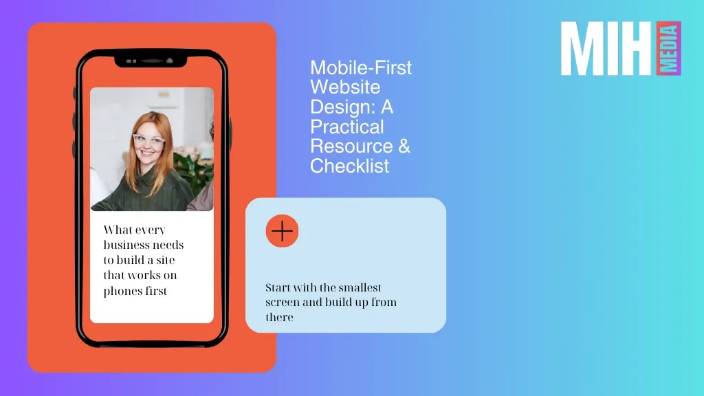
What every business needs to build a site that works on phones first.
Mobile-first website design means you start with the smallest screen and build up from there. Instead of squeezing a desktop layout down to mobile, you design for mobile first, prioritising speed, clarity, simplicity, and user tasks on phones before adapting to tablets and desktops.
Why this matters:
- Most users browse first on mobile
- Google indexes mobile versions first
- Better mobile design = better mobile conversion optimisation
- Stronger mobile-first UX design builds trust and increases lead quality
1. Core Principles of Mobile-First Website Design
✦ Content Prioritisation
Put your most important messages and actions at the top and front. On small screen sizes, every pixel counts. Speak to user intent first.
✦ Speed & Performance First
Mobile users abandon slow pages fast. Compress images, minify code, and remove unnecessary scripts. Tools like PageSpeed Insights and Lighthouse can spotlight performance issues.
✦ Touch-Friendly Interactions
Make buttons and links easy to tap. Avoid tiny targets — aim for at least ~44–48px tappable areas with enough spacing between them.
✦ Simple Navigation
Mobile users want to find what they need quickly. As a result, minimise menu items and use intuitive elements, such as hamburger menus or bottom navigation bars.
✦ Clear Visual Hierarchy
Use headings, whitespace, and content blocks to guide attention, making pages easy to scan.
✦ Accessibility & Readability
Keep fonts legible, contrast high, alt text descriptive, and ensure accessible touch targets for everyone.
2. Mobile-First Design Checklist
Performance & Technical
✔ Compress images with WebP or modern formats
✔ Minify CSS, HTML, and JavaScript
✔ Implement lazy loading for non-critical assets
✔ Use a CDN and caching for faster delivery
✔ Audit Core Web Vitals regularly (LCP, CLS, FID)
User Experience (UX)
✔ Prioritise top mobile tasks in layout
✔ Use short, scannable content
✔ Group related content logically
✔ Make touch targets large and spaced well
✔ Avoid hover-only interactions (they don’t work on touch)
Navigation & Structure
✔ Use collapsible navigation (hamburger or bottom nav)
✔ Keep menu options minimal
✔ Place search prominently
✔ Reduce steps to key actions (quote, contact, checkout)
Forms & Actions
✔ Keep forms short (4–6 fields max)
✔ Use appropriate keyboard types (e.g., email keyboard for email fields)
✔ Provide feedback on form errors in real time
✔ Use sticky CTAs in thumb-friendly zones
Content & Visuals
✔ Headline visible above the fold
✔ Use whitespace to separate elements
✔ Bold or highlight key points
✔ Support content with optimized graphics only where needed
Distraction & Accessibility
✔ Avoid intrusive pop-ups and interstitials
✔ Add descriptive alt text for images
✔ Maintain readable font sizes
✔ Ensure color contrast meets accessibility standards
Testing & Validation
✔ Test across multiple real devices & screen sizes
✔ Test navigation flows and conversion paths
✔ Track user interactions (clicks, scroll depth, drop-offs)
✔ Monitor performance over time with tools like Lighthouse
3. Tips for B2B Mobile-First UX Design
Designing for business buyers often means balancing simplicity with trust signals:
- Use clear service benefits right at the start
- Show testimonials, case studies, and awards above the fold
- Make CTAs obvious: “Request a Proposal”, “Schedule a Call”
- Use click-to-call and click-to-email on key pages
These elements directly support mobile conversion optimisation because they shorten decision paths and reduce friction when a prospect is ready to engage.
4. How Mobile-First Website Design Supports Better Conversions
Mobile-first design doesn’t just improve usability. It impacts business outcomes:
🔹 Faster load times reduce bounce rates
🔹 Simplified layouts increase engagement
🔹 Clear CTAs improve leads and help qualify them earlier
🔹 Mobile-friendly forms reduce friction in your funnel
In short, prioritising mobile makes your business site more efficient and more effective, and that’s where conversions and lead quality improve.
5. Next Steps: Audit, Improve, Measure
Here’s how you can operationalise this checklist:
- Audit your current mobile site (performance, navigation, content)
- Fix quick wins first (images, fonts, buttons, forms)
- Streamline core tasks (quotes, contact forms, CTAs)
- Measure impact (mobile conversions, session duration, bounce)
- Iterate & test regularly – mobile habits evolve
Turn Insights Into Action
If you want a practical, specific mobile-first audit that highlights opportunities for mobile conversion optimisation and UX improvements, I can help build one for your site.
👉 Request a Mobile-First UX Review
Get clarity on what’s working, what’s not, and exactly what to fix next